Top 5 football kits as Puma’s latest Italy jersey continues sentimental trend in shirt designs
Football fans have always been sentimental about their team’s shirts, desperate for a kit that represents the side’s values, history, colours, but also one that looks very stylish and fresh as well, one that could be perhaps worn casually.
So these are a lot of requirements for kit manufacturers to hit at once. It’s not easy to bring all these elements onto one shirt, but with Italy’s latest strip, German giants Puma may just have pulled off another memorable kit.
The Renaissance – Italy
Italy’s latest kit is “inspired by the Renaissance period and designed to celebrate the numerous young talents who are taking increasingly important roles in the Azzurri’s successes”. The latest squad contains 12 players who are 25 or under, and this new era for Italian football is celebrated in this kit.
The colours are taken from Italian Renaissance fabrics and architecture, and the last time the dark green was worn by the side was in a win over Argentina in 1954.
#Italy’s new #Renaissance Kit celebrates the #Azzurri’s rising talents 🇮🇹✨
The article 👉 https://t.co/X6TEUFTUYI@pumafootball drew inspiration from the green shirt worn just once by Italy in the 2-0 win over #Argentina at #Rome’s Stadio Olimpico in 1954#NewWaveRises pic.twitter.com/v4F8yafD6E
— Italy (@azzurri) October 7, 2019
Our top 5
Bruised banana – Arsenal
Arsenal’s ‘bruised banana’ yellow away kit is inspired by the Adidas shirt of the early 90s which Ian Wright played in along with his friend David Rocastle.
As Adidas returned to the Gunners this year to manufacture their shirts once more, they brought back the fan-favourite design that everyone loved, and it’s gone down a storm again this year, bringing back nostalgia and memories of a title-winning Arsenal in a time where the current team is struggling to reach those same heights.
Madchester – Manchester City

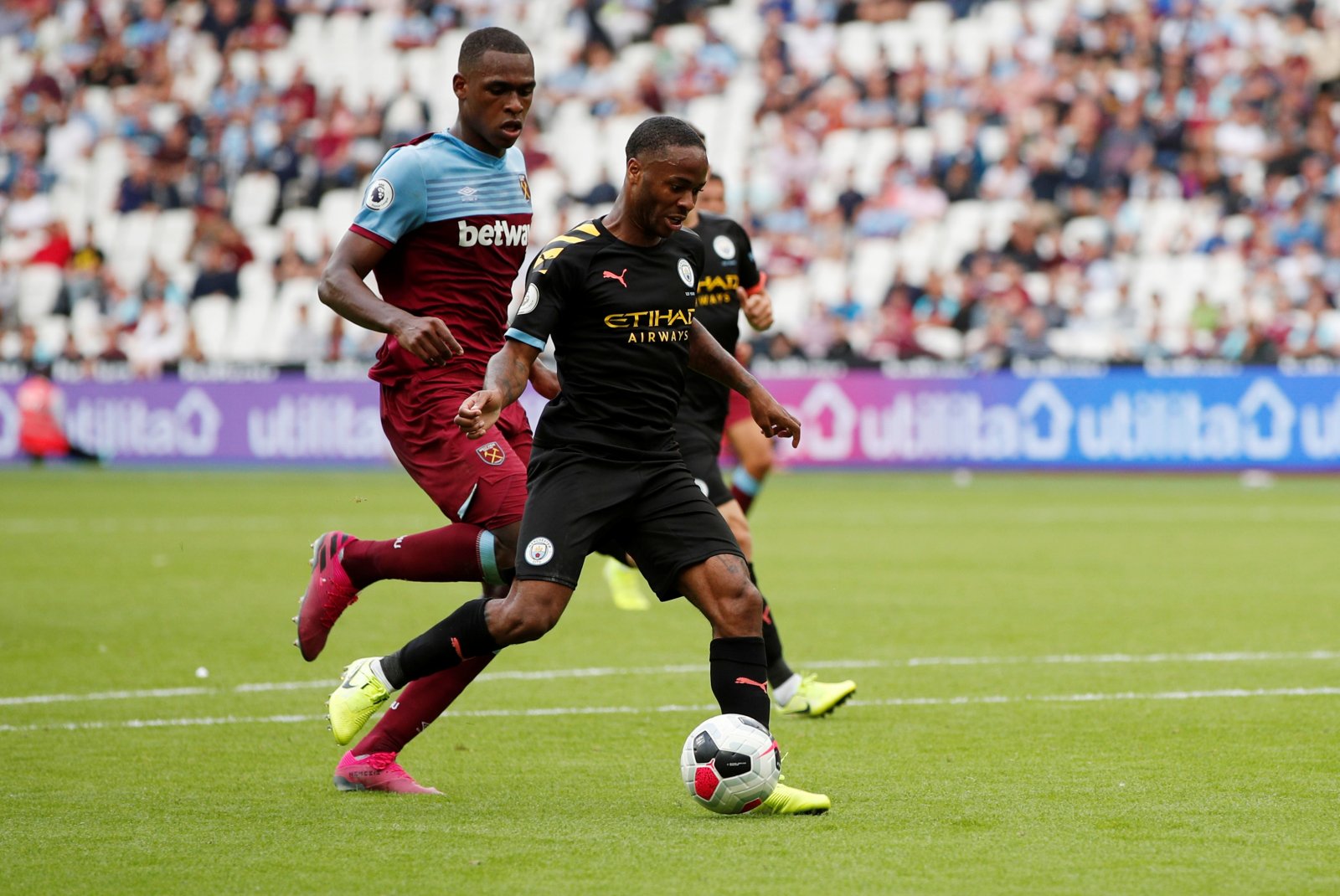
The ‘madchester’ inspired kit is inspired by a period of extraordinary cultural activity in the late 1980s and early 1990s. The club’s website have stated: “The kit is directly inspired by former nightclub, The Haçienda, which was once an epicentre for emerging music, bands, DJs, and artists.
“Using black colour as a base, this Away kit features yellow stripes on the left shoulder: a reference to The Haçienda’s iconic graphic identity. Additional peach and City blue pops create a colourful representation of this legendary cultural icon that was the heartbeat of the city.”
Oktoberfest – 1860 Munich
1860 Munich really hit the headlines when they announced their 2018-19 third kit to be Oktoberfest inspired. The blue shirt coupled with leather brown shorts are certainly unique, but we’re not sure they’ll get the same fan response as the Man City and Arsenal jersey’s. However, it still remains a shirt that’s looking to stand out and be more than just a football shirt.
1860 Munich have unveiled a new Oktoberfest-themed kit – complete with lederhosen shorts. Magnificent! pic.twitter.com/rtL5BMU3tv
— Paddy Power (@paddypower) September 15, 2014
Stamford Bridge – Chelsea

If anything is going to spark ideas for a new shirt, then the stadium in which you play is a good place to take inspiration from. Nike have done that with Chelsea’s Stamford Bridge-inspired top, showing imagery taken from the stadium.
Chelsea commented on this saying: “The Blues have called the Bridge home since 1905, and just as it is woven into our history, it is woven into the fabric of our brand new kit.
“The concept comes to life through a classic Chelsea blue shirt, comprising imagery taken from our famous home. The shirt also features a stylish V-neck, while a red and white ‘CFC’ monogram decorates the back of the collar. The shorts are also blue and the head-to-toe look is completed by white socks which boast a traditional Chelsea red and blue trim midway up the calf. Inside the shirt, a lion borrowed from the club crest is featured with the ‘PRIDE OF LONDON’ written around it.”
City status – Swansea City
50 years ago, Swansea upgraded their status from a town to a city, and their 19-20 third kit design is inspired from this moment in their history. In July 1969, Prince Charles stood on the steps of the Guildhall and announced that the Swansea would now be known as a city, not a town. The football club would eventually officially change its name from Swansea Town to Swansea City in February 1970.
The third shirt still enjoys the old ‘Swansea Town’ crest on the yellow kit, as a memory of the side pre-1970. This piece of nostalgia makes this one of our favourites.
Swansea City third kit for 2019/20 unveiled and it’s a bit special https://t.co/PeztNi1adM
— Swansea City Online (@SwanseaCityLive) September 6, 2019
About author
You might also like
SPORTEL 2021: Day One Recap
This year’s prestigious SPORTEL convention kicked off in sunny Monaco today, welcoming a host of familiar faces as well as plenty of new ones. Doors opened at 8:30am with businesses
Leeds United become first football club to sell official jerseys on TikTok
Leeds United is the first football club in the world to partner with TikTok to sell official merchandise and replica jerseys. Coinciding with the release of the new rhapsody purple,
Lewes FC Appoints Sue Anstiss To Its Board Of Directors
The Lewes FC Board is delighted to announce that it has co-opted Sue Anstiss as a Lewes FC Director. Sue has been a driving force for equality in sport for


